
Data Management Platform
A data publishing and consumption platform for government employees in the Middle East, enabling efficient access and management of critical information.
Tools : Figma, Miro
Role : Senior UX Designer
Duration : 8 months
Product Scope
The platform streamlined the entire data lifecycle—from raw data acquisition and processing to publishing—enabling government employees to efficiently access and consume actionable insights. This solution bridged complex data workflows with user-friendly consumption, driving informed decision-making.
The DMP served as the parent product, architected to unify and streamline two core data-focused applications:
-
Data Marketplace – For publishing, sharing, and discovering datasets across departments.
-
Data Inventory – For managing internal data assets, maintaining metadata, and handling access workflows.
Users were assigned role-based access, dynamically determining whether they interacted with one or both products. Despite distinct functionalities, both experiences were integrated within a single cohesive platform — ensuring seamless navigation and unified user experience.
PARENT PRODUCT
Data Management Platform
Used as the parent platform for unified operation, integrating the core products.
User group : All (based on user roles)
PRODUCT 1
Data Inventory
Used for preparing and publishing data
User group : Data Handlers
PRODUCT 2
Data Marketplace
Used for consuming and accessing data.
User group : End Users
Data Handlers : Data Steward, Data Engineer, Compliance Officer ,Data Quality Analyst, Data Scientist , Machine Learning Specialist ,Data Strategist
End Users : Directors, Executives, R&D Professionals, Academics
Design Approach
Given the platform's technical depth and the presence of two distinct products — one for data publishing and one for data consumption and integrating them in 3rd product— we adopted a structured, iterative approach.
To make the problem space more manageable:
-
The entire system was deconstructed into smaller functional areas, based on user roles, data workflows, and business priorities.
-
Design work was divided into focused sprints, each targeting specific use cases or user journeys.
-
Each sprint involved deep collaboration with stakeholders, developers, and data specialists to align on feasibility and user needs.
This phased approach allowed us to progressively make sense of the platform, test design assumptions early, and maintain momentum in an otherwise complex ecosystem.
MVP analysis and Discovery
When UX became involved, the MVPs for both applications had already been shaped by business and technical priorities. The initial focus was to analyze the existing MVPs to understand how the products facilitated data publishing and consumption.
To build a strong foundation for design decisions, the team:
-
Conducted in-depth stakeholder interviews to uncover goals, pain points, and expectations
-
Held Q&A sessions with developers to understand system logic and constraints
-
Mapped end-to-end user flows to identify usability gaps and inefficiencies
-
Investigated the business rationale and technical processes behind key features and workflows
These activities helped clarify the current product landscape and ensured that future design efforts were aligned with user and business needs
Personal Growth
Bridging the Tech Gap
Where I became the ‘Data Scientist of Design’ !
The products were heavily technical, with complex terminology and domain-specific language dominating MVPs and conversations with business and development teams. This created a steep learning curve for the design team.
With my background as a Full Stack Developer, I stepped in as a vital bridge between the technical and design worlds—translating intricate data processes, clarifying system behavior, and helping the UX, UI, and product strategy teams build contextual understanding.
My contributions proved so impactful that the team started calling me the “Data Scientist of Design.” This role not only accelerated collaboration but also empowered the design team to make sharper, more informed decisions in a complex ecosystem.
As-is Information Architecture
To understand the current structure and user flow of the platform, analyzed the existing information architecture (IA). This helped uncover how data sets, tools, and functionalities were organized and accessed by both data scientists and business users.
The goal was to identify gaps, redundancies, and areas of cognitive overload that could be affecting discoverability, navigation efficiency, and overall usability — especially for non-technical stakeholders. This baseline analysis informed the redesign strategy, ensuring that future improvements were grounded in real user friction points and structural inefficiencies.

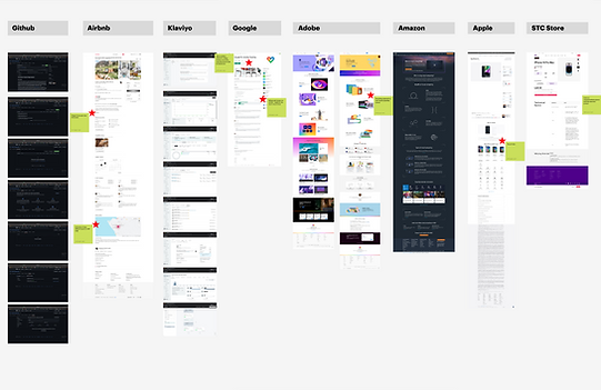
Competitive Benchmarking
To inform our design decisions and ensure the product aligns with industry standards and user expectations, we conducted a benchmarking analysis of leading data platforms. These included tools used by data scientists for data processing and publishing, as well as platforms tailored for business users to explore and consume data insights.
The goal was to identify common interaction patterns, gaps in user experience, and opportunities to differentiate, particularly in areas such as data discoverability, usability of publishing workflows, and clarity in data presentation for non-technical stakeholders.


Personal Growth
Gaining Ground-Level Insights
Where curiosity met real-world insights !
Building a strong foundation for future-state flows and features required not only strategic analysis but also a deep, practical understanding of the users’ world. To achieve this, I took a deliberate effort to engage directly with friends working as data scientists.
This proactive approach uncovered critical insights into their daily practices, challenges, and decision-making frameworks—insights that extended well beyond traditional research. The knowledge gained was actively shared with the team, fostering a deeper collective understanding that enhanced collaboration and informed more effective design decisions.
This initiative was formally recognized by the UX lead as a key factor in grounding design strategy in authentic user experience.
To-Be Flows & Feature Definition
Grounded in extensive benchmarking, MVP analysis, and continuous stakeholder alignment, the future-state flows and feature set were shaped through deep analysis and iterative ideation.
This phase focused on uncovering core experience gaps, reimagining workflows, and prioritizing functionalities that would deliver immediate value while supporting long-term scalability. The resulting framework served as a clear direction for the MVP and beyond.


Concept Design
Given the platform’s layered workflows and domain-specific complexity, the concept design phase demanded strategic exploration grounded in both user understanding and system constraints. We initiated deep-dive brainstorming sessions to unpack functional challenges, evaluate information needs, and reimagine task flows from both publisher and consumer perspectives.
Concepts were ideated through multiple lenses — data visibility, interaction patterns, navigation logic, and modular scalability — and validated continuously through team critiques.
Each iteration was driven by hypotheses: what would reduce cognitive load, streamline decision-making, or simplify data interaction for our distinct user groups?
The selected concept was not only experience-first but also implementation-conscious — striking the right balance between usability and platform logic.
Design Solution
After hundreds of iterations across layouts and interaction patterns, continuous feedback loops with business stakeholders, product owners, and cross-functional teams helped shape the design into a scalable, intuitive solution. Each sprint involved presenting design demos, refining based on feedback, and aligning with evolving business goals and technical constraints.
This process was grounded in a deep understanding of diverse user perspectives—carefully balancing the needs of data publishers, processors, and consumers. The result is a thoughtfully crafted experience that bridges complexity with clarity and supports efficient data interaction at scale.
To ensure design resilience and comprehensive UX coverage, the solution accounted for a wide range of user scenarios, system states, and product requirements, including:
User Scenarios & groups
-
First-time use (onboarding flows, tooltips, guidance modals)
-
Returning users (retained preferences, quick access, recently viewed)
-
User types:
-
Users with and without active subscriptions
-
Power publishers vs. occasional contributors
-
Internal admins, external data consumers, reviewers
-
-
Personalized suggestions (based on search history, behavior, saved preferences)
System Feedback & UI States
-
Empty states (no datasets, no subscriptions, empty cart/search history)
-
Null states (missing metadata, schema gaps, unpublished content)
-
Error states (validation errors, API failures, job execution issues)
-
Zero-result searches (refinement prompts, alternate suggestions)
-
Success & confirmation states (clear next steps, feedback messages)
-
Notifications & alerts (real-time, triggered, contextual)
-
Tracking updates (subscription status, job progress, approval workflows, expiration alerts)
Publishing Workflows
-
Collaborative publishing (shared workspaces, visibility across team members)
-
Publishing lifecycle states: (draft, in progress, in review, published, rejected)
-
Forms & publishing requests (submission, edits, re-approvals, feedback loops)
-
Metadata management (mandatory/optional fields, schema validation)
-
Data source management (add/edit sources, configure connections, draft handling)
-
Dataset types & domain classification (open, restricted, internal; domain tagging, sub-domains)
-
Hierarchy management (structured taxonomy for datasets, domains, and categories)
-
Edge & network management (node relationships, data lineage, dependency mapping)
-
Approval flows (status transitions, reviewer feedback, handoff points)
-
Job execution tracking (Queued, In Progress, Failed, Success, download links)
-
Audit trails & activity history (per user, dataset, and action type)
-
Error handling in publishing (conflict resolution, missing fields, dependency issues)
-
Deletion workflows (soft-delete, permanent delete, dependency checks, audit log retention)
Authentication & Access Control
-
Session management (login, logout, timeout, token refresh)
-
Role-based access flows (viewer, contributor, admin, reviewer)
-
Permission-denied UX (graceful errors, access requests, upgrade paths)
Subscription Workflows
-
Dataset subscription flows:
-
Open access
-
Approval-based
-
Paid
-
Restricted (role-specific)
-
-
Cart functionality (add/remove datasets, batch operations, submission flows)
-
Subscription renewal & expiration states
-
Download experiences (requested formats, access-controlled delivery)
-
Access management (role-based permissions, denied-access UX patterns)
-
Subscription overview dashboards (active/inactive, pending approvals, limits reached)
Navigation & Interaction Patterns
-
Search (autocomplete, fuzzy match, category-based filters)
-
Quick links & shortcuts (frequent actions, saved datasets, recent activity)
-
Sort & filter (multi-select, dependent filters, saved filter views)
-
Pagination & infinite scroll (skeleton loaders, state memory)
-
Menu & navigation widgets (collapsible menus, sticky sidebars, breadcrumb trails)
-
User profile management (account settings, preferences, roles, activity logs)
-
Multiple entry points
∘ From: catalog, notifications, shared links, integrations, saved items, external modules
∘ Via: contextual triggers like buttons, pop-ups, hover actions, and deep links
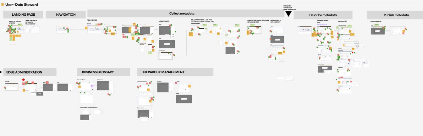
Note: Given the scale and complexity of the product, hundreds of wireframes were created across multiple workflows and user roles. The following selection highlights key screens and interactions that best represent the final solution. Additional wireframes and detailed flows can be shared upon request or discussed in a live walkthrough.
DMP
Home page
Data Steward
First time user

DMP
Home page
Data Steward
Returning user

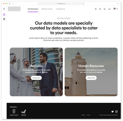
Data Marketplace
Landing page
End User
Returning user


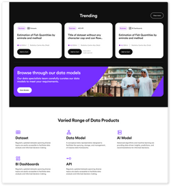
Data Marketplace
Product detail page
End User
Returning user

Data Inventory
Data Source detail page
Data Steward
Returning user
 |  |  |  |  |
|---|---|---|---|---|
 |  |  |  |  |
 |  |  |  |  |
 |  |  |  |
Challenges
Collaborating Across Time Zones
With a global design team spread across Dubai, Saudi Arabia, China, India, Denmark, and Latvia, coordinating workflows initially proved challenging. Time zone differences complicated sync-ups and slowed early progress. Over time, we aligned on shared working hours, structured handovers, and asynchronous collaboration practices—leading to smoother, more efficient teamwork.
Owning the Technical Space
The deeply technical nature of the product posed a steep learning curve for the team, especially around concepts in software architecture and data workflows. My background as a full-stack developer enabled me to step in as a translator between business, tech, and design. I proactively initiated discussions with product owners and development teams, and also guided the design team through key concepts.
What began as a challenge turned into a personal breakthrough: within two months, I evolved from being the most junior designer on the team to leading client presentations, product walkthroughs, and key demos—earning trust across functions.
Managing Complexity at Scale
The scope of the project was vast, with high-volume data workflows and overlapping modules leading to intense sprint cycles and long work hours. The initial phase felt overwhelming. I tackled this by strategically breaking the platform into manageable sections, prioritizing user flows, and taking a phased approach to feature rollout. This structure helped reduce noise and maintain focus throughout the iterative design journey.