
Aas Pass
A hyperlocal commerce startup connecting consumers, retailers, and distributors in India—designed to simplify everyday essentials shopping and streamline local supply chains.
Tools : Figma, Illustrator
Role : Lead Product Designer at the startup
Duration : 6 months
Product Scope
This was a solo, end-to-end design project in a startup focused on building a digital platform that connected Consumers, Retailers, and Distributors—enabling a seamless, hyperlocal commerce ecosystem.
-
Consumers could browse and purchase daily essentials from trusted neighborhood stores with the convenience of digital access.
-
Retailers were empowered to manage inventory, track sales, and source supplies—streamlining operations and connecting directly with both customers and distributors.
-
Distributors facilitated smooth movement of goods and payments across the supply chain, improving efficiency and enabling scale.
My Roles and Deliverables
This project involved dual responsibilities—Brand Identity Design and Digital Experience Design, each involving comprehensive research, strategy, and execution phases.
Design Approach
The vision was to create a brand that feels as approachable as a neighborhood store and as fast as a hyperlocal delivery service—balancing warmth with efficiency.
-
The platform was intentionally not positioned as a traditional green/natural grocery brand, but rather as an urban, convenience-first service for modern lifestyles.
-
For Retailers, the experience needed to be as intuitive as leading digital payment or storefront management tools.
-
For Consumers, it had to deliver the credibility of a major e-commerce brand with the speed and responsiveness of hyperlocal delivery apps.
By focusing on speed, trust, and usability, the design aimed to serve both sellers and buyers with equal clarity—elevating local retail without overwhelming it.
Deep Dive
To inform our design decisions and ensure the product aligns with industry standards and user expectations, we conducted a benchmarking analysis of leading data platforms. These included tools used by data scientists for data processing and publishing, as well as platforms tailored for business users to explore and consume data insights.
The goal was to identify common interaction patterns, gaps in user experience, and opportunities to differentiate, particularly in areas such as data discoverability, usability of publishing workflows, and clarity in data presentation for non-technical stakeholders.


Competitive Benchmarking
To ensure relevance and differentiation in a rapidly evolving market, a detailed competitor analysis was conducted across both Indian and global platforms. This included direct and indirect competitors offering solutions for hyperlocal commerce, digital retail management, and B2B logistics.
The goal was to identify feature gaps, UI/UX patterns, positioning strategies, and unique value propositions—helping shape a product experience that balances familiarity with innovation for all three user groups: Consumers, Retailers, and Distributors.


Personal Growth
Turning uncertainty into opportunity
Finding My Footing in the Design World !
Fresh out of college, Aas Paas became my first real-world, hands-on design project.
It was the middle of the pandemic — a time of uncertainty, hiring freezes, and growing anxieties about where I’d land in my career.
While the world slowed down, I wanted to explore a fast-paced, innovation-driven environment — something I had never experienced before. Having previously worked in a corporate setting, I was curious about the agility, experimentation, and creative culture of startups. This project became my gateway into understanding the dynamic nature of building products from the ground up.
Defining the Brand
A strong brand foundation was essential to build trust and connection across a diverse user base—including consumers, retailers, and distributors. This phase focused on articulating the brand’s vision, mission, and unique value proposition, while identifying the core values and offerings that reflect its purpose.
By defining what the brand stands for and how it intends to serve its ecosystem, laid the groundwork for a consistent and impactful identity—both visually and experientially
Vision
To create a seamless and fast alternative to routine offline shopping—empowering domestic ventures and adapting to the evolving lifestyle of modern consumers.
Mission
Empower local businesses through a digital-first platform that meets modern, convenience-driven consumer needs.
USP
Hyperlocal delivery of groceries and essentials—from neighborhood stores to your doorstep within 30 minutes.
Brand Values
Empowerment
Empowering customers with on-demand convenience, while equipping local vendors with technology to grow and scale.
Connection
Bridging the gap between consumers, retailers, and distributors to foster a well-connected and collaborative commerce ecosystem.
Global to Local
Championing sustainable practices and societal impact by elevating local markets to meet global standards.
Core Offerings
Shop at Your Convenience
No more racing against store hours. Shop for essentials anytime, from anywhere—without sacrificing your downtime.
Special Offers
Get exclusive deals on everyday essentials, along with personalized recommendations based on your shopping habits—making your experience smarter and more rewarding.
Speedy Delivery
Forgot a key ingredient mid-recipe? Need cleaning supplies in a pinch? We ensure essentials from nearby stores reach you in under 30 minutes.
Quick Payments
No queues, no cash hassles. Enjoy smooth, secure checkout with multiple online payment options at your fingertips.
Easy Search
Skip the hassle of crowded aisles and endless wandering. With our intuitive search feature, you can instantly find exactly what you need from your local store’s inventory—saving time, reducing effort, and making shopping smarter and faster.
Real-time Tracking
Stay informed at every step with live order updates, so you know exactly when your items are picked, packed, and out for delivery—bringing peace of mind and full transparency.
Target Audience
In a hyperlocal commerce ecosystem, the user base spans across distinct yet interconnected groups. Understanding both Consumers, who value speed, convenience, and reliability, and Retailers/Distributors, who seek operational efficiency and reach, was essential to shaping relevant and effective user journeys. This dual-layered research helped uncover their behaviors, needs, and pain points—enabling a design approach that aligns with their daily realities.


Part A : Brand Identity Design
Establishing a strong brand identity was the foundation for creating a meaningful and memorable product experience. This phase focused on defining the essence of the brand through exploration of its values, personality, and visual language. From early mindmaps and keyword associations to moodboards and nomenclature, each step contributed to shaping a cohesive identity.
Mindmap
To craft a brand identity that truly connects with consumers, a mindmap was developed to visually capture the platform’s core values, emotional tone, and user expectations.
This helped crystallize key themes like approachability, speed, trust, and convenience—essential for positioning the brand as a modern, urban, and hyperlocal digital service.
The mindmap provided a clear creative framework, ensuring the design reflects the warmth and efficiency central to the consumer experience.

Moodboards
To craft a brand identity that truly connects with consumers, a mindmap was developed to visually capture the platform’s core values, emotional tone, and user expectations. This helped crystallize key themes like approachability, speed, trust, and convenience—essential for positioning the brand as a modern, urban, and hyperlocal digital service.
The mindmap provided a clear creative framework, ensuring the design reflects the warmth and efficiency central to the consumer experience.


Nomenclature
The Nomenclature of a Brand is it’s identity of what it represents and ho it connects to the audience.
The brief about the name was it should be easy to pronounce, mostly in hindi (it being the national language of India) and relatable to the users. I came up with some names, and the most appropriate one was finalized.
Aas Pass
-
A very local, commonly used term that means “nearby” in Hindi
-
Instantly understandable and relatable to both consumers and vendors
-
Rooted in everyday conversations—enhances brand recognition
-
Simple to communicate and easy to market across geographies
-
Perfectly aligns with the brand’s core values of convenience and reliability
-
Evokes a sense of assurance, closeness, and constant availability
-
Domain name was available, making it viable for digital presence
Identity Design
The success of a brand lies in how it is perceived and experienced by its users, as well as those who represent it. Every interaction—visual, verbal, or experiential—is an opportunity to leave a lasting impression. And often, it’s the first impression that shapes a person's long-term attitude toward the brand, ultimately influencing behavior and loyalty.
After understanding the product, its core attributes, and the target audience, it was time to translate these insights into a compelling visual identity.
The process began with quick explorations on paper, gradually evolving into digital iterations. Various directions were explored—ranging from monogram-based, symbolic, and digitally adaptive identities—to find a balance between uniqueness, recognition, and relevance to the brand’s values.
Concept Explorations


-
User Centric
-
Always nearby
-
Reliable
-
Caring
-
Empathetic


-
Perks of a physical store
-
Located nearby
-
Recognition
-
Recall value
-
Instant Delivery
-
On the go
-
Always available
-
Passionate
Final Approach

Color Psychology
-
Reinforces the 30-minute delivery promise through energy and urgency
◌ Evokes a sense of speed, enthusiasm, and reliability -
Commonly used in food marketing for its appetite-stimulating effect
◌ Typically found in ripe fruits and vegetables
◌ Triggers hunger cues and emotional connection -
Supports brand visibility and user memory
◌ Encourages immediate action through strong recall
◌ Acts as a visual call-to-action in digital touchpoints -
Adds vibrancy and warmth to reflect a modern, hyperlocal brand identity
Typography
-
Nunito is a balanced, modern sans serif typeface
◌ Features smooth, rounded terminals that feel approachable and friendly
◌ Designed by Vernon Adams to maintain digital clarity and legibility -
Aligns well with the brand tone of comfort and accessibility
◌ Blends structure with softness—making it ideal for both headlines and body copy
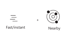
Approach
-
The brand name Aas Paas is based on geographical proximity, making a location-based symbol a natural fit for the identity.
-
The logo symbol is composed of three key components, each reinforcing the brand's role in the user's everyday life:
-
Inner Circle
◌ Represents the user—their needs, wants, and preferences
◌ Reinforces the brand’s user-centric and empathetic nature -
Location Symbol (encircling the inner circle)
◌ Denotes coverage and reliability, assuring users that their preferred products and stores are within reach
◌ Embodies the brand’s trustworthy and reliable character
◌ Communicates comfort and assurance, making users feel supported -
Outer Small Circle
◌ Symbolizes doorstep delivery and ease of access
◌ Encourages users to remain in their comfort zone, trusting the brand to handle fulfillment


Part B : Digital Product Design
Establishing a strong brand identity was the foundation for creating a meaningful and memorable product experience. This phase focused on defining the essence of the brand through exploration of its values, personality, and visual language. From early mindmaps and keyword associations to moodboards and nomenclature, each step contributed to shaping a cohesive identity.
User Research
To ground the product in real-world behavior and needs, in-depth interviews were conducted with a diverse set of users and stakeholders. This included young professionals, homemakers, and local vendors—each offering a unique perspective on convenience, shopping habits, and technology adoption. The goal was to understand their pain points, motivations, and expectations to inform a design that truly resonates with their daily lives.
Consumer insights
Seller insights
42% people visit the nearby stores twice a week for grocery shopping.
88% of the audience make their online purchases based on the brand and ratings and reviews of the products.
90% of Retailers & Distributors prefer Online Apps to accept payments.
82% of the audience loved the idea of an app that delivers grocery from nearby grocery stores
76% people felt that offline grocery shopping is very time consuming and are annoyed by the space being so overcrowded.
89% of Retailers & Distributors face issues while Managing Stocks & Invoices.
88% people hate to carry the grocery shopping bags all the way back to home.
88% of Retailers are not able to create proper invoice, because of overcrowding in store.
88% of Retailers & Distributors are comfortable taking orders online.
60% of the consumers expect the items to be delivered within 30 mins of order placement.
45% of Retailers give Daily Order to distributors
90% of Retailers & Distributors loved the idea of an app that will help them list product, Create Invoice, Manage acc & Accept Payment.
Empathy Mapping
To better understand user behavior, empathy mapping exercises were conducted online in collaboration with cross-functional colleagues. The goal was to visualize what users would Think, Feel, Say, and Do when interacting with the product.
Two separate empathy maps were created to reflect both perspectives:
• Customer: Focused on convenience, trust, and delivery experience.
• Seller: Focused on discoverability, order management, and ease of use.
This exercise helped identify user motivations, concerns, and behavioral patterns, which later informed design decisions across both consumer and vendor journeys.


User Personas
A deep understanding of the target audience is essential to crafting meaningful product experiences.
User personas serve as a foundational tool to answer the key question: “Who am I designing for?”
By identifying user expectations, motivations, and pain points, personas guided design decisions that aligned closely with real user needs—ensuring the product remained relevant, empathetic, and user-centered throughout the process.


User Journey
Understanding how users interact with a product over time is key to identifying gaps and opportunities in their experience.
The user journey map helped visualize each stage of the interaction—from discovery to purchase and post-delivery—highlighting user goals, emotions, and potential friction points.
This mapping exercise ensured that the digital experience was seamless, intuitive, and aligned with user expectations at every touchpoint—especially within a hyperlocal, time-sensitive service like Aas Paas.


Personal Growth
Breaking the wall to user insights
Navigating research in challenging times !
Getting genuine user insights during the early pandemic days was a challenge in itself. Retailers and distributors were not only hard to reach, but also skeptical about sharing details of their business operations.
Their hesitation wasn’t surprising—trust takes time, and these were uncertain times. Every conversation felt like breaking through a wall, but the insights that eventually emerged proved invaluable for shaping the product.
Product Catalogue
Grocery or daily essentials fall under a vast umbrella with an overwhelming number of items. To ensure a smooth and intuitive browsing experience, I aimed to streamline this variety into well-structured, user-friendly categories.
To inform the categorization strategy, I:
-
Conducted informal interviews with potential users to understand how they naturally classify grocery items while shopping.
-
Studied competitor platforms to analyse industry-standard methods of grouping products.
-
Iterated through multiple classification models to strike a balance between comprehensiveness and simplicity.
The final set of categories was designed to align with user mental models, helping them quickly locate what they need—making the shopping experience faster and more efficient.

Information Architecture
The Aas Paas mobile application is built around one core promise: convenience. The user experience should feel so seamless and efficient that it clearly outshines the traditional alternative—stepping out in the sun, navigating crowded stores, standing in long queues, and returning home drained.
To achieve this, designed a well-thought-out information architecture that:
-
Mapped out the full structure of the application
-
Grouped related content to reflect logical hierarchies
-
Defined intuitive navigation paths that support user tasks
Creating a detailed sitemap not only helped visualize the product’s framework but also enabled better decisions around layout, content placement, and user flow.
A strong information architecture ensures users can:
-
Reach their intended destination faster
-
Explore options without feeling overwhelmed
-
Navigate effortlessly through key journeys—be it discovering products, comparing categories, or placing an order
Ultimately, the smoother the path, the more satisfied the user.
Consumer Information Architecture


Seller Information Architecture


Low Fidelity Wireframes
Before diving into the visual design, I created low-fidelity wireframes to focus on layout, functionality, and user flow without the distraction of colors or graphics. These wireframes served as the foundation for structuring content, prioritizing features, and aligning with the user journeys mapped earlier.
They helped:
-
Visualize the core experience early on
-
Identify usability issues before development
-
Communicate ideas quickly across teams
Wireframing was essential to ensuring that the experience was intuitive, the navigation was seamless, and the interface supported user goals effectively.


Personal Growth
Reality check: beyond the classroom
Navigating research in challenging times !
Working on a real-world product quickly made me realize that it’s far more complex than any classroom project. There were funding limitations, stakeholder priorities, technical constraints, team coordination issues, and, above all, the unavoidable money matters.
A feature that looked simple on paper often required costly third-party integrations, instantly turning an exciting idea into a strategic decision. It taught me that every design choice has layers of business reality beneath it.
Visual Design
The visual identity of Aas Paas was crafted to reflect a modern, hyperlocal, and user-friendly experience. The goal was to make the app not only visually appealing but also emotionally resonant—instantly relatable, trustworthy, and easy to navigate.
The visual language balances clarity and character, supporting both usability and brand recognition. Before jumping into the interface design, I explored moodboards and visual direction keywords to anchor the design approach and ensure alignment with the brand personality, target audience, and product promise.


Style Guide
A well-defined style guide ensures visual and functional consistency across the product experience. It serves as the foundation for maintaining a unified tone, aesthetic, and interaction pattern throughout the platform—strengthening the brand identity and improving usability.
This section outlines the core visual elements that bring the Aas Paas brand to life, including:
-
Typography
-
Colour Palette
-
Illustration
-
Iconography
-
Button Hierarchy
These guidelines act as a reference for both design and development teams to deliver a seamless and cohesive product experience.
Nunito is a well-balanced sans serif typeface with smooth, rounded terminals, designed by Vernon Adams. Its friendly and approachable feel makes it suitable for a wide range of interfaces.
-
Available in multiple weights, offering flexibility for both headings and body text.
-
The rounded forms enhance readability and convey a sense of comfort and accessibility.
-
Its clean structure ensures clarity across digital screens, making it ideal for mobile-first design.
Nunito complements the brand tone—modern, user-friendly, and reliable—while supporting a visually cohesive experience throughout the platform.
Typography

Colour Palette
The primary colour of the brand is Red, chosen for its ability to evoke urgency, energy, and action—perfectly aligning with Aas Paas’ core promise of speedy 30-minute delivery.
-
Red: Acts as a bold Call to Action and enhances visibility across digital touchpoints.
-
Shades of Grey: Serve as secondary colours, balancing the vibrancy of red while creating a minimal and clean visual aesthetic.
-
Hues of Blue: Used as tertiary accents, blue evokes trust, security, and reliability—ideal qualities for an e-commerce platform.
The thoughtful balance of these colours ensures a vibrant yet grounded interface, enhancing usability while reinforcing brand personality.

Primary
Secondary
Tertiary
Illustrations
Illustrations are used to bring warmth, personality, and emotional connection to the Aas Paas platform.
-
The illustration style is simple, soft-edged, and user-friendly, complementing the brand’s empathetic tone.
-
They help in explaining concepts visually, especially in onboarding screens, empty states, and info messages.
-
Colors used in illustrations follow the brand palette to ensure visual consistency and recognizability.
Illustrations play a key role in humanizing the experience and making the digital product feel more approachable and relatable.


Iconography
A custom set of icons has been designed to reflect the essence of the Aas Paas brand identity.
-
The icon style draws inspiration from the logo’s visual language, ensuring coherence across the interface.
-
Each icon is minimal, intuitive, and friendly, aligning with the application's clean and approachable design tone.
-
Designed for clarity at small sizes, they enhance usability and support quick user recognition of actions and categories.
The cohesive icon set contributes to a seamless, visually unified experience throughout the platform.
System icons

Category icons creation process:

Category icons

UI Design
This section showcases the final UI screens that bring the Aas Paas experience to life. Every visual decision reflects the insights gathered through user research, empathy mapping, and iterative prototyping.
-
The screens demonstrate a clean, intuitive, and responsive interface that aligns with the brand’s hyperlocal and user-friendly identity.
-
Visual elements, layouts, and interactions are crafted to support speed, clarity, and trust, reinforcing the brand's core values.
-
The design aims to make everyday shopping frictionless and delightful, while maintaining consistency in tone and usability.
These high-fidelity mockups represent the culmination of the design process—translating strategy into a tangible, real-world digital product.


Challenges
From Classroom to the Real World
Fresh out of college, this was my first hands-on experience designing a real-world product from the ground up. Unlike academic projects, this involved managing end-to-end responsibilities—research, strategy, design, and delivery—while navigating shifting priorities and real-world constraints. By staying adaptable, learning quickly on the job, and collaborating closely with cross-functional teams, I was able to successfully steer the product through all stages, ensuring it met both user needs and business goals.
Breaking the Ice with Reluctant Users
Conducting user research in the early pandemic phase was no easy feat—especially when our target users were local retailers and distributors who were naturally hesitant to share details about their business operations. Trust was the first hurdle. I overcame this by adopting a relationship-first approach, speaking their language, finding common ground, and gradually easing into research conversations. This helped gather critical insights that shaped the product’s foundation.
Design Dreams vs. Budget Realities
In a classroom, ideas flow without constraints. But in the real world, every feature had to pass the test of technical feasibility and financial viability. For instance, some visually impressive features required costly third-party API integrations—making them impractical for the initial launch. By prioritizing core features and finding low-cost alternatives, I ensured the product remained both impactful and within budget.
Designing with Feedback in Real Time
Static designs rarely survive first contact with the real device. I implemented frequent rapid testing, checking layouts, typography, and color contrasts directly on target devices throughout the design process. This helped catch usability and visual issues early, saving time and ensuring that what looked good on Figma also worked flawlessly in users’ hands.